Monday, 18 January 2016

Planning: Creative brief for advert

Creative brief for advert

When making our creative brief for our advertisement we had to create a brief which would help us to better create a visual representation of what we want to make and want to have on the advertisement of our project, this is important because we have to ensure that we gt the visual portrayal of the album correct, however we also have to make sure that we don't make the poster identical to the digipak as we would lose buzz and interest of our project.

Josh and I created this together so we had a brief to follow when launching this product.

Who are they and why they are collaborating?

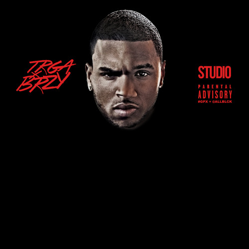
The artist we have created go by the name of Sweeney and MD who are both R&B/ Hip Hop artists from the UK Rap scene who are now releasing their new collaboration album 'YingYang'. They recently just came off their individual tours around Europe which sold out immediately in most places including London, France, Germany and Belgium. Both Sweeney and MD's tours have allowed their names to stardom into fame, placing their top singles at the top of the charts in the UK underground scene. The demand for both artists to collaborating has been hyped immensely on social media which for both artists, is another great opportunity to gain more success. Their loyal fan bases have been trying and worked together for quite some time to finally convince the two artist to collaborate. This album will hopefully please each artists fan base and satisfy their demand for this star combination.


Album and print advert concept

The two artists both being at the top of their careers means that this album must create no controversy between the ''favoritism'' that could possibly shown within their album Ying&Ying. Each artists has their own fan base mainly from the UK who we are hoping will increase due to this collaboration. Therefore we will produce the two artists with a 50/50 split ratio throughout the album. We will do this by consistently showing clear opposites between the two artists by: in music videos we will have one artist dressed in white and the other in black, on the album cover, one artist will be represented in white and the other in black.


With our print advert, we want to able to promote this idea through various forms of print media, where it can be displayed at bars, clubs, billboards and UK music magazines. We want to increase the visual promotion of this album concept which is why Josh and I believe that if we make an advert that stands out visually, it will attract many, existing and new fans. 

Comparable products


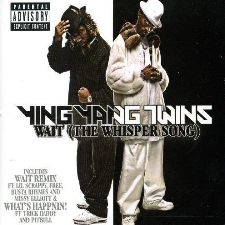
These two artists are a due who go by the name of Ying Yang Twins which immediately grabs the theme of ying and yang. There albums follow a similar idea of ours as they are also represented as 'opposites' through the use of color within the the of the digipak and also their clothing in which they also consistently follow their black vs white them throughout their campaign. Although their idea is very much like ours we will portray the concept of Ying and Yang to a further extent as we will include this in our music videos.


Audience

As both artists are from the UK Rap scene, they will have a similar, loyal audience. The audience will mainly consist of young males who are aged between 16-25, working class, audience category of C2-E and the ethnicity that will mainly be interested in our product will be black and Asian males. 

The two artists both being at the top of their careers means that this album must create no controversy between the ''favouritism'' that could possibly shown within their album Ying&Ying. This is taken into consideration as there are many stereotypes within collaborations between two artists. One of the main ones being audiences will tend to favor one artist more whereas some audiences would favor the other, therefore conflict and controversy would occur if artists are 'better' that the other artist on the album. 


Launch days

Album Release: 30th January 2016
Press campaign: 9th January 2016
TV Launch: 13th January 2016


Conclusion

I believe that creating the brief was beneficial so we could give the members of our group a crystal clear idea of what we are trying to create with the advert as some people may not fully understand and get the wrong interpretation of what we are trying to present. 

Friday, 8 January 2016

Research into conventions for the advert

Research into conventions for the advert


Intro:
The reason why we have created an advert for our album is because we are promoting the musical campaign of 2 artists collaborating on a single album visually. The poster will help to raise awareness as well as building a higher level of anticipation for the album before its release. 

Which two you looked at and why?
Me and my group looked at two artists, Jay Z and Skepta that portray similar artist representations that we wanted to portray within our two performers. The main representation were young black artists coming from a ghetto background however instead of portraying the stereotypical and negatively viewed black artist we wanted to portray artist that will be a positive influence on their audiences. 
Our two artists 'Sweeney' and 'MD' will 


This is sketch of the type of advert design we would like to create. My music video concept being 'ying and yang' showing complete opposites between the two performers is the same idea we want to portray within the advert. This sketch is close up shot of both performers heads edited and cut in half to be morphed together as one head. With the ying and yang logo as our background both faces will be edited to show a clear dividing in half in between the logo.; Sweeney being on the white half of the Ying & Yang logo and MD on the black half of the logo. The main idea is to show a clear 50/50 ratio between the two artist. Our idea is very similar to an existing collaboration album by Chris Brown and Trey Songz.

The conventions I would like to apply as a result of this research activity are...

  • Album title (placed at the top of the poster)
  • Artist name (Color coordinated with the design
  • Artist image (clear 50/50 ratio of the showing of both artists) 
  • Production company (will always be next to the album name to show who owns the album)
  • Where the album is available e.g iTunes, 'In Stores Now', Amazon etc. (placed at the bottom of the poster, with the brand logos of the apps/companies you can purchase the album from.)
  • Main singles from album (Can be listed next to the brief details of the album which gives teasers to the audience, attracting them to the album with known, top of the chart singles.)
  • Parental advisory log if required. (if needed, the logo will be placed 

Overall, this research has been helpful to our planning because... 

We need to enhance the star image in our poster which allows the people and fans to see who's album it is, as well as it presenting to the people the first primary and initial theme that holds the project together. 

Research: Censorship


Censorship

Censorship within media is something that comes up and is always tested. In the music industry censorship can be pushed to its limits as it can be seen as hard for artist and audience to find the line between freedom of speech and expression also known as 'art' and what is seen as inappropriate. 

If explicit content is mentioned or seen in a music video or soundtrack it is usually followed up with the 'Parental Advisory' symbol. This symbol is used to notify the public of its explicit content and that it is up to the parent or guardian's consent that any person under 18 can be exposed to this. 

Genres that have been known to carry the 'Parental Advisory' symbol:
  • Hip-Hop - Violent, sexual and drug abusive content.
  • R&B - Sexual content within lyrics. 
  • Rock - Violent and drug abusive content.
There are 14 topics that have the right to be censored if presented in either a sound track or a music video, these are:
  1. Shock - Footage that the audience could find traumatic and disturbing.
  2. Violence - Scenes too violent can also be deemed inappropriate. 
  3. Graphic Representation - If scenes are considered as to graphic (gory or explicit) the can be censored. 
  4. Language - Explicit language may be found as inappropriate by the audience.  
  5. Sexual Violence - Sexual Violence is a topic that could make viewers very disturbed and uncomfortable. 
  6. Domestic Abuse - Scenes of domestic abuse and violence could possibly upset the viewers. 
  7. True Events - Using true stories and events is a very sensitive subject as people that where possibly affected by these events could find it upsetting or offensive. 
  8. Culture - If culture is shown in the wrong way it can be seen as offensive by others which is why it gets censored. 
  9. Race - Racial misinterpretation can also be seen as offensive.
  10. Class - Like racial interpretation social classes can also find misinterpretation offensive.
  11. Corrupting the young - Corrupting children and youth (underage) can lead them to do things such as copy what they see or be influenced by things they do not fully understand which is potentially dangerous for them to do so. 
  12. Political Controversy - Political controversy has the right to be censored as it could slander a  political figures reputation and change the peoples political views which could lead to problems such as rioting and disruption within society.  
  13. Nudity & Sex - Sex and nudity can be seen as inappropriate in the eyes of young children hence the reason why it is censored. 
  14. Drug Abuse - Drug abuse is an illegal activity which is why it is not often shown and is censored. 
All 14 topics can be censored because a large group of people can come to disagree with what is shown and might find whatever is shown as offensive, upsetting or inappropriate for viewing, hence the reason why is can be censored. 
Wavey music video


In this music video the music video itself does not breach any rules of censorship for any scenes of it to be censored out  as it is not an excplicit music video, however the sound track contains diluted explicit lyrical content (very few swear words) and the N word which is said twice by artist two (Youngs Teflon) which would offend our viewers, it is for this reason why we have planned to censor out the lyrics of the soundtrack and blur artist lip sync within the music video. 

To conclude, my understand of censorship has been beneficial because it is something that me and my group have to consider because our music video contains themes of drugs and violence within  the music video's soundtrack and visuals which viewers could potentially find upsetting which means that we need to be careful about what we show to the people when filming the music video so that we film enough to make it enjoyable but not too much to make it explicit to the highest possible level.

Planning: Digipak analysis


Planning: Digipak analysis

During one of our planning lessons, we had to analyse digipaks that have been created by artists that have a similar representation in the industry to our artists and try to take out some of the good key points that are in their work in order to apply a similar structure to that of ours. 

For our digi pack analysis we choose to look at:
The End Of The Beginning - Skrapz


Blue Print 3 - Jay-Z


General findings:

  • Bold outstanding colours.
  • The title of the album is also labeled in quite a big bold outstanding sized font.
  • Artist image is apparent however it is slightly being lost in the darker lighting.
  • Parental advisory symbol is present.


From this research here is some key factors that I am looking for in my project:

  • We want a close up shot of both of our artists, in in order to best present star image.
  • Lighting will also be brighter in order to enhance the star image of both artists.
  • We will be using contrasting colors throughout the digipak (white for 1 artist black for another) this will again make our artists stand out within the digipak equally. 
  • Facial expressions that will be used we be quite serious to present the themes of professionals being in their element which helps to build the anticipation of the digipak visually as it must be considered as the visual interpretation of the albums tracks.
To conclude I believe that the digipak is extremely important as it is considered as the face of the album and the entire musical campaign to an extent, this is why we must create something of a visual sensation to excite and engage fans both old and new and also best capture the primary themes of the album.


Wednesday, 6 January 2016

Planning: Shot List


Planning: Shot List


This is the shot list that was created by our group