Labels

Showing posts with label Research and Planning: Advert. Show all posts

Friday, 5 February 2016

Planning: Drafts of Adverts


Drafts of Advertisement
Before creating our final product, Josh and I had to go through various drafting to ensure we were creating a conventional product. Each time we developed a new idea or made changes, we received feedback from our teacher and peers that we knew liked the UK rap genre, as their feedback was beneficial for us in order to make improvements. 

Draft 1:


Positives:
1) Clear consistent campaign relating to digipak.
2) Colour scheme compliments the eye.
3) Relevant/ key information on poster.
Improvements:
1) Cropping around artist 1 (SWEENEY) head to eliminate all green areas.
2) Looks like a movie poster, very similar.
3) Parental advisory symbol (Digipak only).


Draft 2:


Positives:
1) Photoshop is much better around the artists
2) Layout is complimentary to the theme of the advert

Improvements:
1) Try and crop even smoother around SWEENEY'S image
2) Where you write about where it is available to download from, change typography 
3) The symbols of availability should be the same size


Conclusion: 
This process has been crucial in order for us to ensure that we create a product that is complimentary to all our other products. Further, the feedback has been invaluable to allow us to make the appropriate changes needed to reflect our genre. As this is a product that will be on public display, we need to ensure it is eye catching and I believe that if we make the changes advised in our draft 2 'improvements', we can do this. 

Monday, 18 January 2016

Planning: Creative brief for advert

Creative brief for advert

When making our creative brief for our advertisement we had to create a brief which would help us to better create a visual representation of what we want to make and want to have on the advertisement of our project, this is important because we have to ensure that we gt the visual portrayal of the album correct, however we also have to make sure that we don't make the poster identical to the digipak as we would lose buzz and interest of our project.

Josh and I created this together so we had a brief to follow when launching this product.

Who are they and why they are collaborating?

The artist we have created go by the name of Sweeney and MD who are both R&B/ Hip Hop artists from the UK Rap scene who are now releasing their new collaboration album 'YingYang'. They recently just came off their individual tours around Europe which sold out immediately in most places including London, France, Germany and Belgium. Both Sweeney and MD's tours have allowed their names to stardom into fame, placing their top singles at the top of the charts in the UK underground scene. The demand for both artists to collaborating has been hyped immensely on social media which for both artists, is another great opportunity to gain more success. Their loyal fan bases have been trying and worked together for quite some time to finally convince the two artist to collaborate. This album will hopefully please each artists fan base and satisfy their demand for this star combination.


Album and print advert concept

The two artists both being at the top of their careers means that this album must create no controversy between the ''favoritism'' that could possibly shown within their album Ying&Ying. Each artists has their own fan base mainly from the UK who we are hoping will increase due to this collaboration. Therefore we will produce the two artists with a 50/50 split ratio throughout the album. We will do this by consistently showing clear opposites between the two artists by: in music videos we will have one artist dressed in white and the other in black, on the album cover, one artist will be represented in white and the other in black.


With our print advert, we want to able to promote this idea through various forms of print media, where it can be displayed at bars, clubs, billboards and UK music magazines. We want to increase the visual promotion of this album concept which is why Josh and I believe that if we make an advert that stands out visually, it will attract many, existing and new fans. 

Comparable products


These two artists are a due who go by the name of Ying Yang Twins which immediately grabs the theme of ying and yang. There albums follow a similar idea of ours as they are also represented as 'opposites' through the use of color within the the of the digipak and also their clothing in which they also consistently follow their black vs white them throughout their campaign. Although their idea is very much like ours we will portray the concept of Ying and Yang to a further extent as we will include this in our music videos.


Audience

As both artists are from the UK Rap scene, they will have a similar, loyal audience. The audience will mainly consist of young males who are aged between 16-25, working class, audience category of C2-E and the ethnicity that will mainly be interested in our product will be black and Asian males. 

The two artists both being at the top of their careers means that this album must create no controversy between the ''favouritism'' that could possibly shown within their album Ying&Ying. This is taken into consideration as there are many stereotypes within collaborations between two artists. One of the main ones being audiences will tend to favor one artist more whereas some audiences would favor the other, therefore conflict and controversy would occur if artists are 'better' that the other artist on the album. 


Launch days

Album Release: 30th January 2016
Press campaign: 9th January 2016
TV Launch: 13th January 2016


Conclusion

I believe that creating the brief was beneficial so we could give the members of our group a crystal clear idea of what we are trying to create with the advert as some people may not fully understand and get the wrong interpretation of what we are trying to present. 

Friday, 8 January 2016

Research into conventions for the advert

Research into conventions for the advert


Intro:
The reason why we have created an advert for our album is because we are promoting the musical campaign of 2 artists collaborating on a single album visually. The poster will help to raise awareness as well as building a higher level of anticipation for the album before its release. 

Which two you looked at and why?
Me and my group looked at two artists, Jay Z and Skepta that portray similar artist representations that we wanted to portray within our two performers. The main representation were young black artists coming from a ghetto background however instead of portraying the stereotypical and negatively viewed black artist we wanted to portray artist that will be a positive influence on their audiences. 
Our two artists 'Sweeney' and 'MD' will 


This is sketch of the type of advert design we would like to create. My music video concept being 'ying and yang' showing complete opposites between the two performers is the same idea we want to portray within the advert. This sketch is close up shot of both performers heads edited and cut in half to be morphed together as one head. With the ying and yang logo as our background both faces will be edited to show a clear dividing in half in between the logo.; Sweeney being on the white half of the Ying & Yang logo and MD on the black half of the logo. The main idea is to show a clear 50/50 ratio between the two artist. Our idea is very similar to an existing collaboration album by Chris Brown and Trey Songz.

The conventions I would like to apply as a result of this research activity are...

  • Album title (placed at the top of the poster)
  • Artist name (Color coordinated with the design
  • Artist image (clear 50/50 ratio of the showing of both artists) 
  • Production company (will always be next to the album name to show who owns the album)
  • Where the album is available e.g iTunes, 'In Stores Now', Amazon etc. (placed at the bottom of the poster, with the brand logos of the apps/companies you can purchase the album from.)
  • Main singles from album (Can be listed next to the brief details of the album which gives teasers to the audience, attracting them to the album with known, top of the chart singles.)
  • Parental advisory log if required. (if needed, the logo will be placed 

Overall, this research has been helpful to our planning because... 

We need to enhance the star image in our poster which allows the people and fans to see who's album it is, as well as it presenting to the people the first primary and initial theme that holds the project together. 

Wednesday, 16 December 2015

Planning: Advertisement Information


Planning: Advertisement Information

For our music campaign it is key that we have an advertisement because, not only does this raise the awareness of the album to the fans and people in general but it also to help build and establish a connection from the artists to their fans.

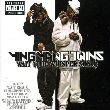
First of all we had to do research on advertisements for albums, me and my group came up with the advertisement for 'The End Of The Beginning' by Skrapz and 'The Blue Print' by Jay-Z and this is what we had managed to analyse. 


The common conventions that we had found out that appears in many of the advertisements was:
  • Release date.
  • Album title.
  • Artist name.
  • Where you can purchase and download the product from.
  • Artist image.
  • Hit singles to be placed on the advertisement.
  • Parental advisory symbol (if needed).


For that reason we will have the following information placed on my album's advertisement.

Image: Artist image of MD & SWEENEY with their faces merged in a 50/50 split.

Cinematography: For the advertisement we will be using a closeup shot to get the head and shoulders of our artists, enough to see the colour of their clothes for when we merge their faces together showing the contrast in clothing between the 2 artists.

Costume hair and makeup: White and black costume contrasting each other.

Lighting & colour: White and black lighting and colour used due to the influential colours  of the Ying and Yang theme. 

Settings: For this there will be no settings as we will take the picture in front of a green screen, to better the effect of the black and white background when editing the advertisement.

Body language and facial expression: Due to the fact that our artists are already meant to be established artists within our project they will have stern, focused and quite serious expressions.

Persuasive language used: We will announce it as 'The most anticipated collaboration of this year' as the two artists are already meant to be big names within the industry and their genres of music.

Information: As for the additional information that we been seen on our advertisements are:

  • Release date of album.
  • Key songs on the album for example 'Like Me' which is the song we are performing in our music video.
  • Where the Album can be purchased.
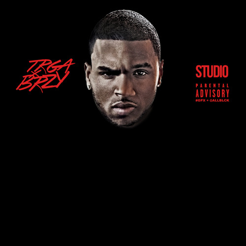
LayoutFor our advertisement seeing as my group have decided that because our project is a joint collaboration album we will have both of the  star artists in the advertisement, however we will distribute the layout of the page 50/50 between the two artists as this will help them to better attract and merge their individual fan base which is similar to that of the Trey Songz and Chris Brown collaboration album titled 'TRGA X BRZY' (image below) as you can see both artists faces have been merged together. Our advertisement will have a similar layout as we will be going for contrasting shots because our album is influenced by the Ying and Yang theme.

Theories used in advertisement:

Dyer (star image) - Star image is used as our artists will be placed on the front cover of the advertisement.

Goodwin (enhanced star image) - Goodwin's theory of enhanced star image will be used in our advertisement our cinematography will be close up shots of both our artists and they will be the center of attention which helps to enhance their star image as they are already highly famous and will known, also because the background is just white and black colours this means that there isn't much else to look at besides the artists face, which enhances their star image and shows how important they are as nothing else is shown.   

Adorno (pop culture) - Our front cover will show a slight aspect of pop culture as the clothing worn is considered to be popular and conventional to artists that come from our artists genres.